Cake Kingdom: Experimental User Interface
Most website interfaces have a “traditional” layout: navigation at the top, the footer at the bottom and the content somewhere in the middle. For this project, the challenge was to create an interface that was different or unconventional.
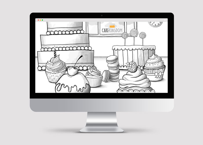
I created a website for a cake shop. My idea was to use a parallax effect with three levels (front, middle and back) and so create a virtual cake-shop countertop. Upon opening the website on the desktop and moving the mouse, the user would feel as if he/she is looking around the shop (going from left to right). To incorporate content I placed different cakes on three levels that, when clicked on, provided different bits of information. This added a fun aspect to the interface because the user did not know what information each cake contained.


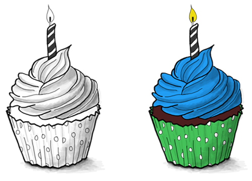
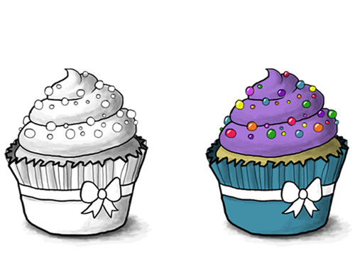
Since all the cakes in the shop would all be handmade, I wanted the artwork to reflect this. Hence I drew all the visuals using Adobe Photoshop and a Wacom. Not to overload the interface, all illustrations are black and white, only changing colour when clicked on.

Finally, I programmed the website using Html, CSS, and JavaScript.
This short video illustrates how the website functioned.